
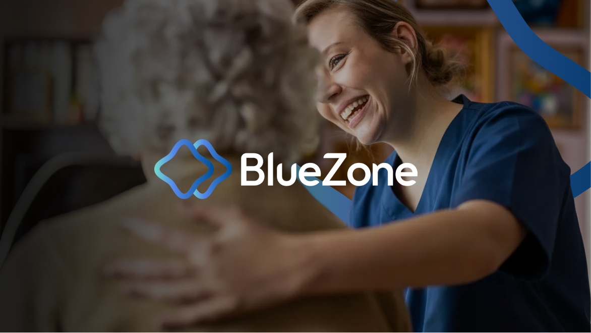
The team at BlueZone is passionate about keeping older Australians healthy through movement. We’re passionate about keeping brands healthy through content. Together, we hit a home run.
BlueZone asked The Content Division to design all-new branding that emphasised its modern approach to allied health. The brief gave us plenty of space to flex our design muscles, and we’re pretty sure we racked up a P.B.
The challenge
BlueZone takes its name and its mission from longevity hotspots around the world – the “blue zones” where residents enjoy longer, healthier and more active lives.
Modelled on real communities of super-agers, BlueZone translates unspent funds in older Australians’ Support at Home packages to research-led exercise programs for clients in home care. It trains carers to deliver preventative health programs designed by exercise physiologists and other allied help experts at scale, empowering clients in home care around Australia to take back their independence.
The benefits are long-lasting and structural for people receiving home care, for communities and for the healthcare system at large.
As a newcomer to the allied health scene, BlueZone needed a market-ready design system that was dynamic, user-friendly and accessible to older audiences. It had to be legible as a visual identity, too; every design choice aligned with BlueZone’s ethos and goals.
We were tasked with developing logo options, an accompanying style guide and other brand assets. At least one detail was decided for us – BlueZone’s team agreed that blue was a “no-brainer.” (Well, yeah!)
Our approach
First, we designed three thoughtful logo concepts for BlueZone to choose from. Each logo brought a sense of fluidity and movement, tailored to the brand identity.
At the outset, we wanted the logomark to reflect the big-heartedness of BlueZone’s vision for older Australians. The winning design captured the sense of community and connection at the heart of its model: Two overlapping shape outlines in blue gradient, like two squares sloping gently inwards, or twin ‘plus’ signs with soft edges. A rippling gradient of turquoise, cobalt and sky blue recalled the surface of water. The overlapping shapes drew inspiration from “blue zones” around the world; hubs of vitality, health and community.
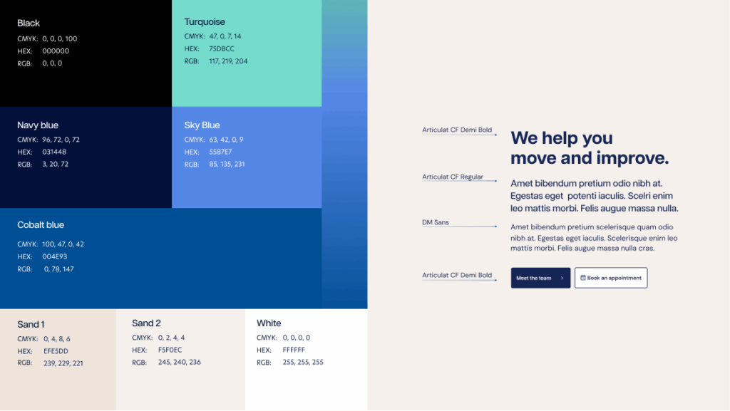
With BlueZone’s logo decided, we refined the wordmark. Accessibility was a priority. Early in the process, we landed on a crisp and professional navy blue sans serif typeface for high contrast and readability.
The chosen wordmark was solid and steady, with ascenders and descenders tapered to a slant to lend it zip and agility. We played with angles, highlighting the soaring shoulder in the ‘n’ and the nick of blank space where it met the stem, like a mountain range.
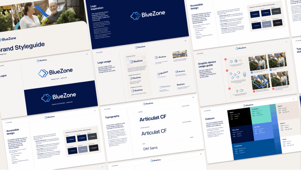
Last of all, we delivered a comprehensive style guide to match BlueZone’s new logo and wordmark, with usage examples and rules to help BlueZone keep its new branding consistent, accessible and polished across the board. A colour palette of light neutrals and blues tied everything together.
The results
BlueZone’s new look is refined and functional, with a personal touch. Our brand development brings BlueZone’s philosophy of movement and community to life with considered details and guidelines for application.
Courtesy of The Content Division, BlueZone’s new branding includes:
- A logo, including icon and wordmark
- Rollout-ready brand assets, including logo files in multiple formats
- A style guide, including colour palette, font set and rules and examples for application
With sleek new assets and a cohesive visual language already applied to the website, BlueZone has everything it needs to take the brand to market.
We helped BlueZone begin its journey. Now BlueZone helps people receiving home care begin theirs.
“The BlueZone team here was so happy with TCD’s ideas and work the whole way through their process. They really nailed the brief quickly, and allowed us to get that design language into our website and supporting marketing assets quickly. We love the outcome and the brand is already growing, which is a testament to how distinctive the creative work is in the category. It’s also impactful while being simple to execute – absolutely vital for us in a small internal team getting things done fast. The younger members of the team here declared it was ‘so aesthetic’, which I’m told means they loved it. And that’s a big win.”
Kurt Sanders – Head of Brand and Growth at BlueZone and Envigor