Making an imPact: A brand refresh for SurePact
SurePact is a leading cloud-based SaaS solution designed to streamline the grant management process for both grantmakers (funding bodies) and grant recipients.
In 2024, SurePact set its sights on growing its customer base, increasing its market share and bolstering its brand equity. But the company faced a challenge: standing out in a sea of blue and highly corporate offerings while maintaining brand recognition.
With expectations set by B2C and freemium SaaS tools, SurePact needed to clarify its product offering and tone to meet today’s market expectations. The goal was to ensure that both grantmakers and recipients could easily grasp that SurePact is a modern software product by incorporating slick UI graphics and a brighter colour palette into its visual identity.
The Content Division was engaged to refresh SurePact’s brand, while maintaining its core look and feel – focusing on quick, targeted changes that would make a significant impact.
A new look
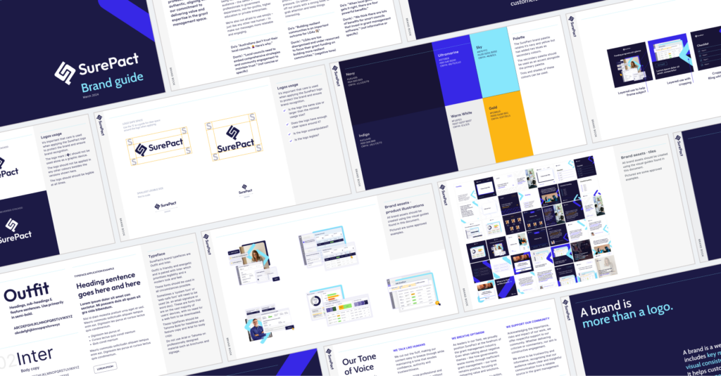
Our design team introduced a high-contrast colour scheme to complement the existing navy and gold. The font was also modernised, transitioning from Raleway to bolder, more contemporary typefaces: Outfit, for a friendly and energetic vibe, and Inter, to enhance legibility with its modern look and feel.
We also gave their logo a subtle update with cleaner lines, and added a graphic device for use across branding materials as needed. This graphic device was inspired by the logo mark but simplified for ease of application. These updates ensured the brand felt fresh, but still maintained continuity with previous iterations.
The brand refresh also carried across to the new website, where our team designed over 20 modules in Elementor that could easily be dragged and dropped to create and update pages, while retaining the flexibility to edit the details for each page.
A new sound
But it wasn’t just about looks. We produced a tone-of-voice guide to ensure consistency across all written content. The goal was to create a more human, clear and concise communication style, making SurePact’s message more accessible to busy grant administrators working in government, NFP, and other purpose-driven organisations.
These new brand guidelines ensure that everyone understands how SurePact should look and sound, aligning with the company’s commitment to delivering value and expertise in grant management.
The new look and feel are reflected in SurePact’s social and website templates, creating a cohesive brand experience across all touchpoints.
A sure thing
These changes were made without reinventing the wheel, keeping the core of SurePact’s brand intact. SurePact now stands out in a crowded market, especially on the event circuit, with a refreshed brand that is clearer, brighter, and able to cut through at every touchpoint.
The Content Division continues to create, roll out and promote content for the brand to showcase SurePact and its clients as the company and its software progresses.
Making an imPact: A brand refresh for SurePact
SUREPACT
July 26, 2024
SurePact is a leading cloud-based SaaS solution designed to streamline the grant management process for both grantmakers (funding bodies) and grant recipients.
In 2024, SurePact set its sights on growing its customer base, increasing its market share and bolstering its brand equity. But the company faced a challenge: standing out in a sea of blue and highly corporate offerings while maintaining brand recognition.
With expectations set by B2C and freemium SaaS tools, SurePact needed to clarify its product offering and tone to meet today’s market expectations. The goal was to ensure that both grantmakers and recipients could easily grasp that SurePact is a modern software product by incorporating slick UI graphics and a brighter colour palette into its visual identity.
The Content Division was engaged to refresh SurePact’s brand, while maintaining its core look and feel – focusing on quick, targeted changes that would make a significant impact.
A new look
Our design team introduced a high-contrast colour scheme to complement the existing navy and gold. The font was also modernised, transitioning from Raleway to bolder, more contemporary typefaces: Outfit, for a friendly and energetic vibe, and Inter, to enhance legibility with its modern look and feel.
We also gave their logo a subtle update with cleaner lines, and added a graphic device for use across branding materials as needed. This graphic device was inspired by the logo mark but simplified for ease of application. These updates ensured the brand felt fresh, but still maintained continuity with previous iterations.
The brand refresh also carried across to the new website, where our team designed over 20 modules in Elementor that could easily be dragged and dropped to create and update pages, while retaining the flexibility to edit the details for each page.
A new sound
But it wasn’t just about looks. We produced a tone-of-voice guide to ensure consistency across all written content. The goal was to create a more human, clear and concise communication style, making SurePact’s message more accessible to busy grant administrators working in government, NFP, and other purpose-driven organisations.
These new brand guidelines ensure that everyone understands how SurePact should look and sound, aligning with the company’s commitment to delivering value and expertise in grant management.
The new look and feel are reflected in SurePact’s social and website templates, creating a cohesive brand experience across all touchpoints.
A sure thing
These changes were made without reinventing the wheel, keeping the core of SurePact’s brand intact. SurePact now stands out in a crowded market, especially on the event circuit, with a refreshed brand that is clearer, brighter, and able to cut through at every touchpoint.
The Content Division continues to create, roll out and promote content for the brand to showcase SurePact and its clients as the company and its software progresses.